CMYK or Pantone inks
Knowing the applications of CMYK and Pantone colors is essential to ensure the highest quality printing results. Computers utilizing HTML colour, style sheets or RGB colour are not capable of creating a perfect colour match when printed. For bright, accurate colouration in your printed documents CMYK or Pantone is the way to go.
CMYK Colours
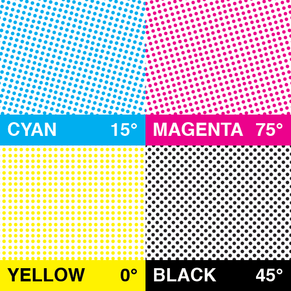
As the standard system for printers around the world, CMYK is the system by which different colors are created by layering process colours; cyan, magenta, yellow, and black. The CMYK model is uses in a great deal of print materials, like magazines and newspapers. If your document contains full-colour photograhs/illustrations or utilizes multi-colour graphics involving too many colours to reproduce with Pantone shades then CMYK is your best bet.
By Arz (Own work)
Pantone Colours
Similar to the system used in house paints, Pantone Colours (also known as PMS Match Inks or Spot Colours) are numbered with each number corresponding to a swatch sample. Any of the available pantone colours is created by mixing 13 base pigments in specified amounts, providing a level of consistency that is unmatched in other formats. Pantone colours are champions of usability, as no matter their application and no matter if physical comparison is impossible, the colours will always remain consistent. Pantones primary uses are as follows:
- Precise color matching for branding or logos
- Large areas requiring consistency and saturation
- Maintaining colour consistency throughout multiple page documents
- Vibrant hues and precise shades
- Special effects such as metallics, pastels, or flourescents
All major brand identities utilize the pantone system to ensure applications of their logo and branding is universal no matter where or how it is utilized.
Our stock and custom Flags also are assigned pantone numbers this keeps them looking consistant no matter when they are printed.
For Example:
Canada flag red PMS 186
Union Jack Blue PMS 280
![IMG_0622.[1]](https://auroraflags.frontlinewebhost.com/wp-content/uploads/2019/12/IMG_0622_1.jpg)
Combining CMYK and Pantones in a Single Document
It is often difficult for some documents to utilize either CMYK or PMS colour models exclusively, as both have very specific applications. In situations like the ones below, it is necessary to combine these systems to ensure the highest print quality:
- Pages containing full-colour images and logos simultaneously.
- Certain complex graphics are difficult to duplicate using PMS colours and will require use of CMYK
- Metallic logotypes utilized in conjunction with complex graphics/illustrations or full-colour images.
The knowledge of these two colour systems and their proper use is essential in turning your web-based or digital files into hard copies with vibrant, bright, and eye catching colouration.
In addition to our printing services Aurora offers free colour matching services on all orders to make sure you get a perfect match every time!
We also offer a free proofing service which enables you to view your product before its printed! For most consistant results we recommend not viewing your proofs on a cell phone to ensure correct colour and sizing requirements.
Still need help? one of our graphic designers will be happy to assist you

